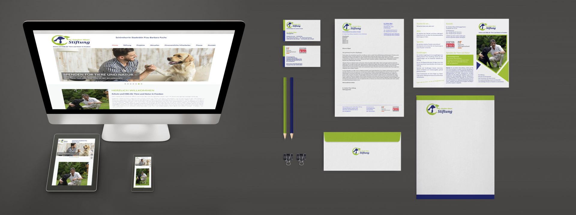
Corporate Design
Corporate design is a sub-point of corporate identity. It represents the individualized appearance of each company. The C.D. Should in principle be thought through at the start-up of the company and adapted to the entire company. Corporate design encompasses both the areas of writing, language and color concepts, as well as a uniform logo development as well as design concepts and illustrations. For each individual area, a uniform occurrence is a great advantage to create a recognition value not only for the customer, but also for corporate clients. The aim of C.D. is among other things internally and externally a sense of belonging to create.
In addition to recognizability, the practical use should also be taken into account. Each logo, inscription and color concept can be designed as unicum, which optimizes your market positioning and presents clear branding for your label or product.
Design concepts
After designing the design team, the design team will be able to cast the projects, products and services to be applied in the right form. The design concept is the visual implementation of the project concept, approved by the company management, which is oriented on sales and distribution. Strictly aligned with corporate identity and corporate design, it brings together the key facts that enable a company to operate successfully in the long term on the market.
On the basis of basic knowledge about sales and trading forms as well as the corresponding key figures of your company, it is now possible to submit a design concept that is geared to a measurable success. Concepts and design concepts go hand in hand.
Successful design concepts generally refer not only to the current advertising approach, but also include a clear and comprehensible structure, which refers to your entire corporate identity. This can be extended and optimized over many years.
Such a long-term design set offers the possibility to reflect the individual advertising campaigns and, if necessary, to replace them in the overall design concept.
Use design concepts with a system!
Logo Development
The logo is one of the most important elements of corporate design. It represents the compressed form of what constitutes the enterprise in its entirety. The most important property of a logo is the recognition. In order to stand out from the competitor, it should be as meaningful as possible and create associations with the observer. Today, when we speak of world-famous brands, we have the appropriate logos in our minds. This must also happen with your target group.
It is not always necessary to create a completely new logo. Often, it is also sufficient to adapt to new orientations of the company due to mergers or market changes. A company logo should always be up-to-date and appropriate to the current company orientation.
Another aspect is the employee identification with the corresponding logo and the values that are hidden behind it. The consistent and consistent logo strengthens the WE feeling in the company.
Your logo is the personality of your company. It is only when you and your employees can identify with it that you increase not only the perception, but also the self-esteem and overall appearance of your company.
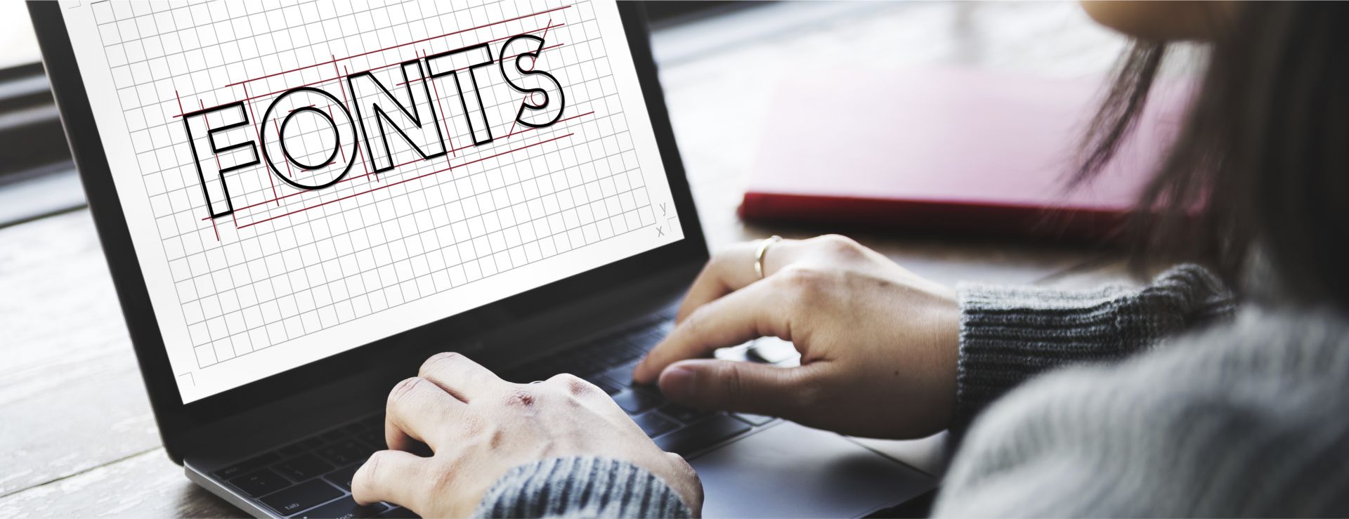
Typeface Development
A corporate font is the font used by a company predominantly or even exclusively to achieve a uniform look. It is part of corporate design and corporate identity.
There are fonts with a matter-of-fact and technical appearance, playful fonts and inscriptions, as well as emotional and extremely individual character fonts.
The inscription, however, should be primarily readable and have a high degree of recognition. As it reflects corporate philosophy, it is essential to use it consistently throughout all business and advertising campaigns in order to give your customers the feeling of being "already familiar".
A handwriting that fits into the product offer underscores the individual character of your company.
When choosing the handwriting, aspects such as simplicity, size and strength can play a role. But handwriting or a futuristic design can be recommended in one case or another.
Together with the other areas of corporate design, this creates a memorable and thoroughly professional image, the corporate identity.
Imagery
Images are at the forefront of information gathering. With images, emotions can be better conveyed and they activate the viewer more, thus resulting in a faster contact between the picture and the viewer.
This knowledge can be used for the advertising sector. The employees of Scheid & Partner can advise you on how pictures are perceived, what circumstances encourage or prevent the perception, and how images are reflected in the context of the text.
Four factors are of great importance to develop their own language:
Duality: different image contents or statements contrast with each other
Information: The image conveys knowledge that is new, original and exciting
Surprise:
rarity, gestures, original shapes and colors, as well as double exposures, distortions and blurring captivate an observer or customer
Seduction: In the case of sophisticated graphical representations, such as 3D landscapes,
landscape presentations, etc., the viewer must feel that
"I want to be there"

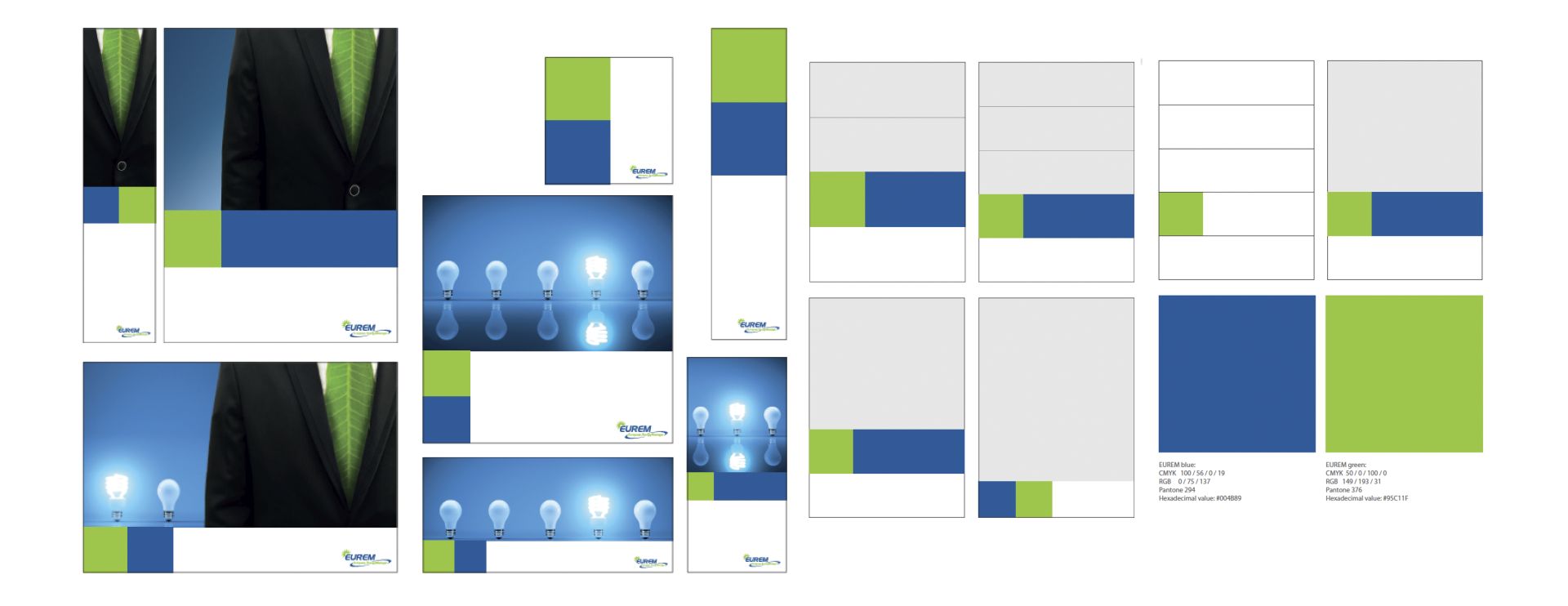
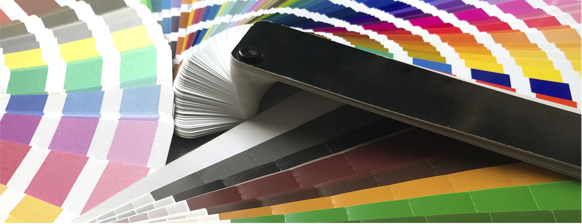
Color Concept
Each person connects colors with certain feelings and situations in his life. Moments of anxiety, well-being, security, or danger. Thus "red" is generally perceived as an active, dangerous and passionate color, while "green" is perceived as a color of nature. It stands for freshness, health and vitality. For example, "blue" can be associated as a soothing element.
Therefore, the color concept of a company must be considered: What feelings do you want to arouse with the coloring of the viewer? If a customer is confronted with too many different colors, which ultimately overwhelm his perception, he probably will not linger long on a website. However, if the coloring is too simple, the viewer loses interest quickly.
A balanced and coordinated coloring is therefore of paramount importance for every website, brochure or other advertising material.
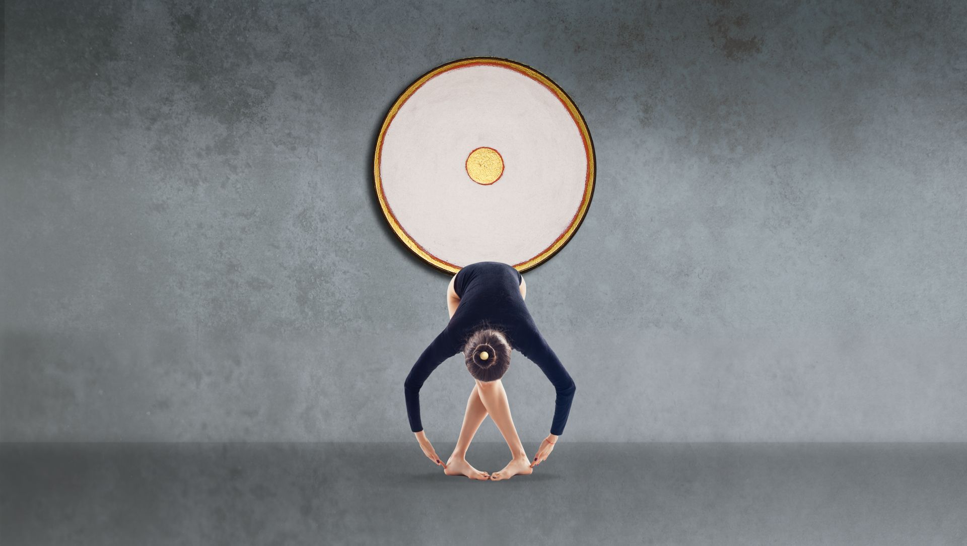
Illustration
The illustration in terms of advertising and packaging illustration has gained in importance over the past 50 years. The picture, which is attached to a text, is intended to illustrate a situation and make it comprehensible. Illustration is used to visualize information in such a way that it is quickly accessible to the viewer and is clearly accessible.
Of great importance are the pictorial designs also with regard to the mediation of moods, which are to be triggered by the advertised product. Through illustrations, the viewer's emotional level can be approached rather than by the processing of classical text content.
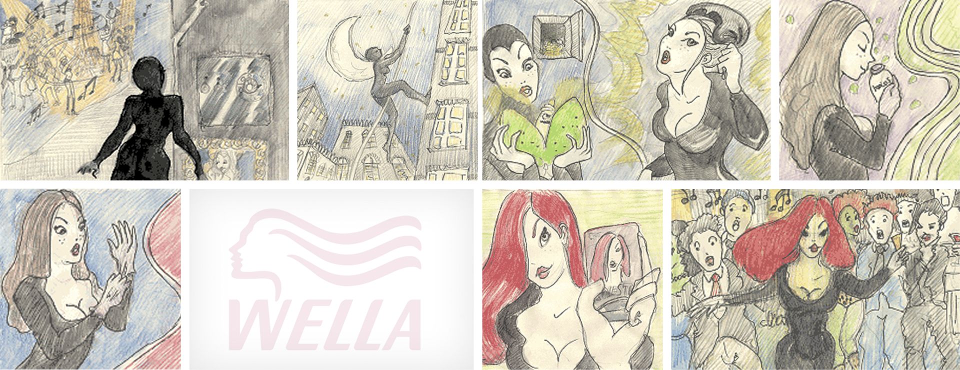
Illustrations are also used in film production in order to present results quickly and without great effort. These are usually presented as hand-drawn "Below the Line - Illustrations or Storyboards".
Illustrations make it easier for us to perceive and understand complex processes quickly. They are an ideal visual aid.